

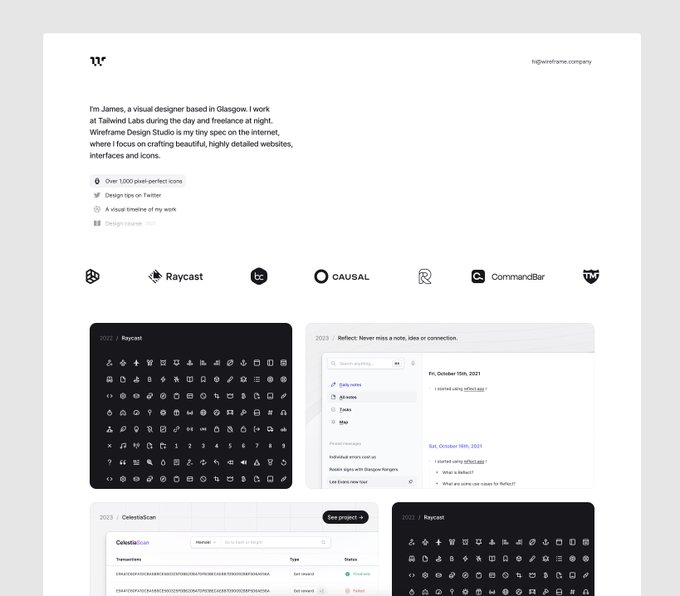
Wireframe Design Studio
@wireframe
Followers
4,706
Following
1
Media
65
Statuses
319
A tiny design studio. Clients ‣ @restreamio @voiceflowhq , @whopio , @reflectnotes , @raycastapp , @canvas , @causalhq , @axiomfm
🪐
Joined April 2012
Don't wanna be here?
Send us removal request.
Explore trending content on Musk Viewer
México
• 1326658 Tweets
Morena
• 767833 Tweets
casillas
• 471596 Tweets
Xóchitl
• 416357 Tweets
CDMX
• 342428 Tweets
The Loyal Pin is Coming
• 322584 Tweets
PREP
• 258252 Tweets
緊急地震速報
• 209831 Tweets
AMLO
• 181851 Tweets
El INE
• 139735 Tweets
PRIAN
• 112556 Tweets
Maynez
• 92221 Tweets
Televisa
• 81118 Tweets
#BILLKINBAGUCCI
• 80010 Tweets
Oilers
• 59585 Tweets
$GME
• 53379 Tweets
Natalie
• 30049 Tweets
Edmonton
• 27238 Tweets
Otros 6
• 24751 Tweets
Bucaramanga
• 22716 Tweets
Kaveh
• 22062 Tweets
McDavid
• 16742 Tweets
Tommie
• 13113 Tweets
SmangatPRABOWO UntukNKRI
• 13056 Tweets
KitaKOMPAK KitaKOKOH
• 12258 Tweets
kcon
• 11763 Tweets
グッズ・ボイス販売
• 11394 Tweets
Last Seen Profiles


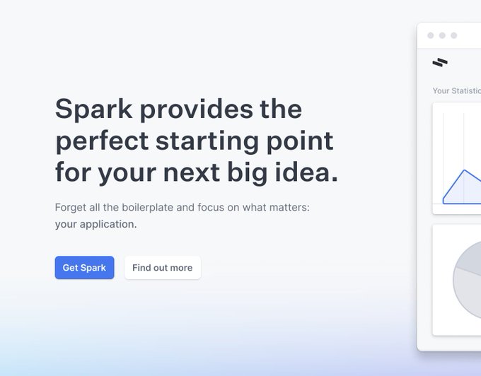
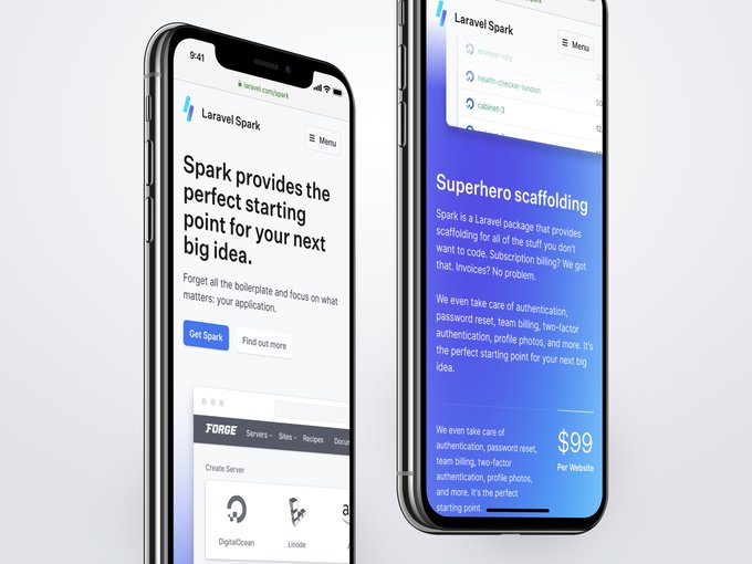
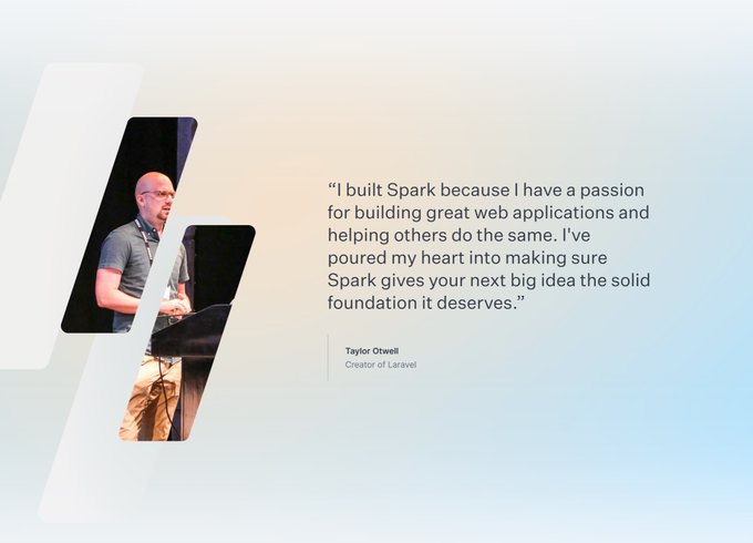
Excited to be working alongside
@taylorotwell
again. This time redesigning Laravel Spark. Keep your eyes peeled for more updates... 👀
4
2
106
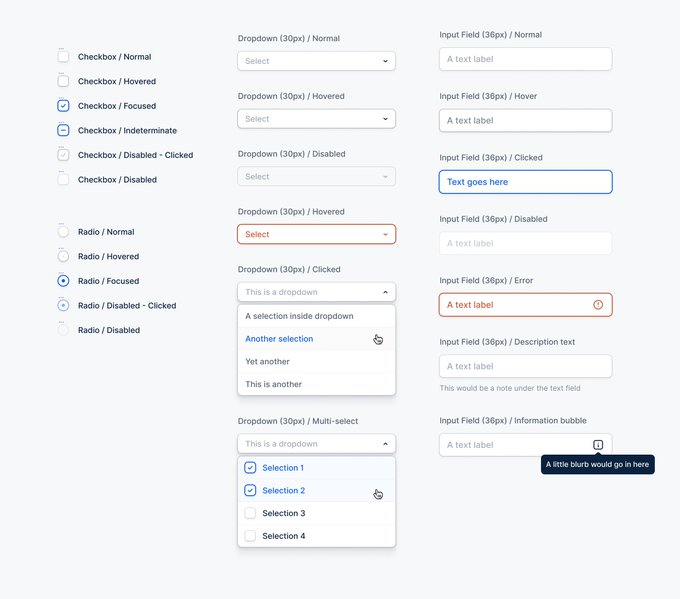
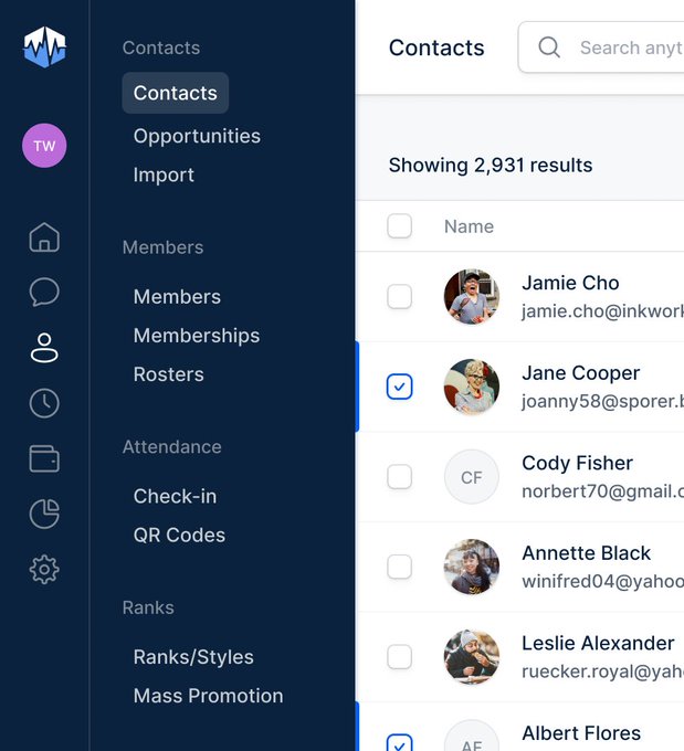
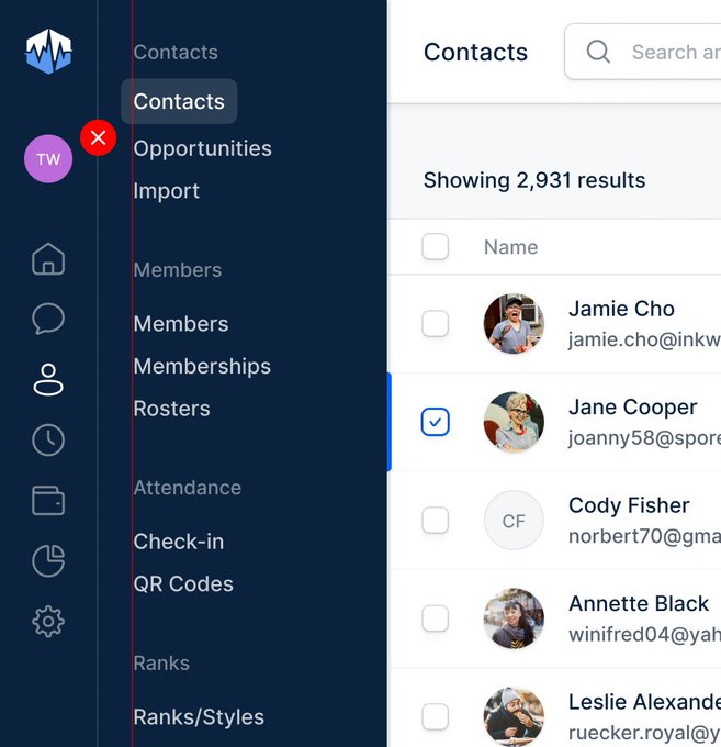
Slowly building out the component library for Pulse. Have a great weekend folks!
3
3
104
A lot of people are really curious about how I create the gradient blurs in some of my designs.
Who’s interested in a mini-video series, showing you how I go about doing it? Maybe a few different examples, for different types of designs?
10
2
95
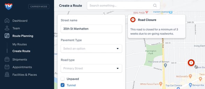
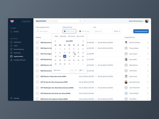
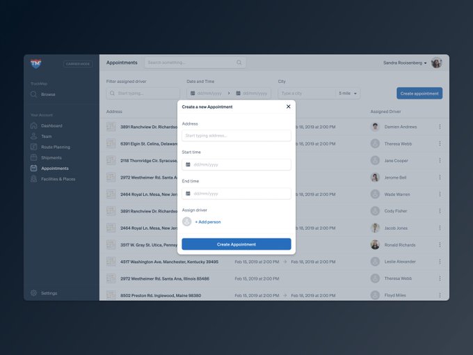
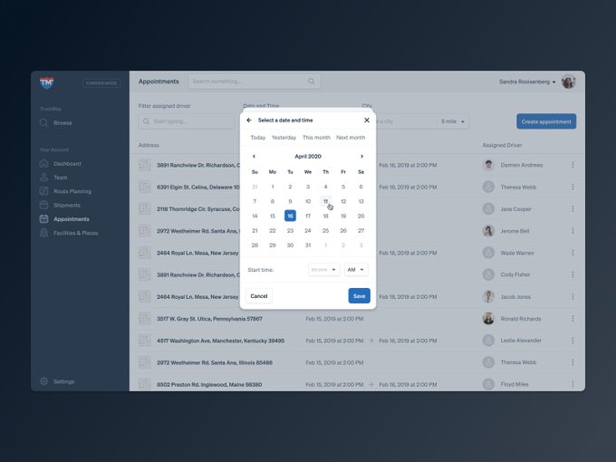
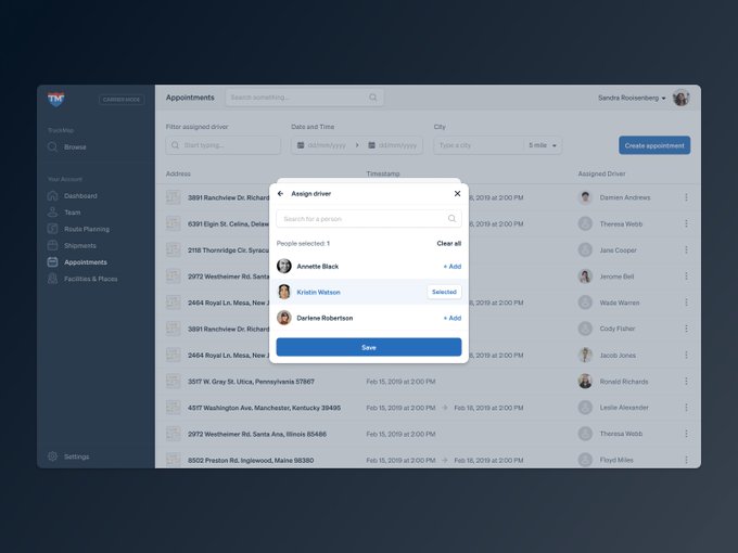
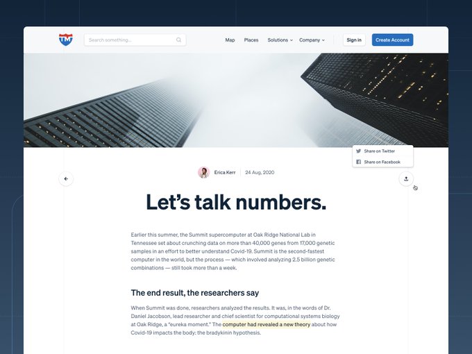
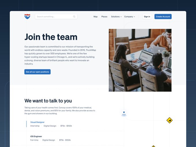
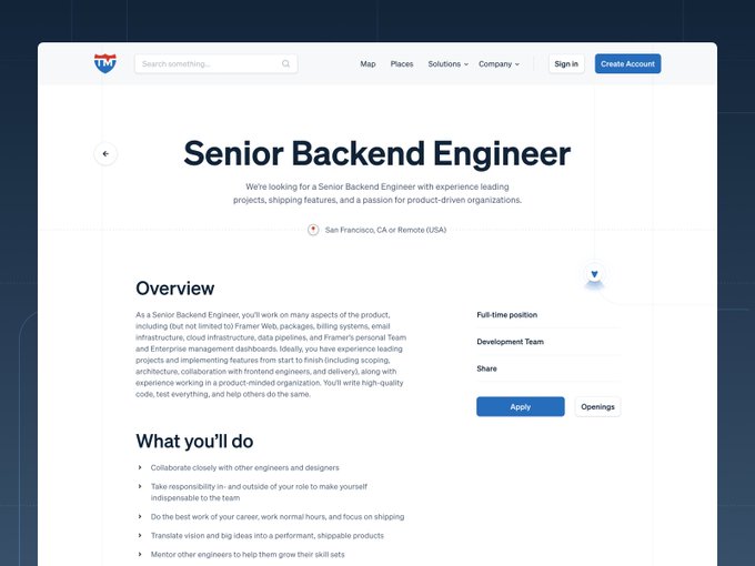
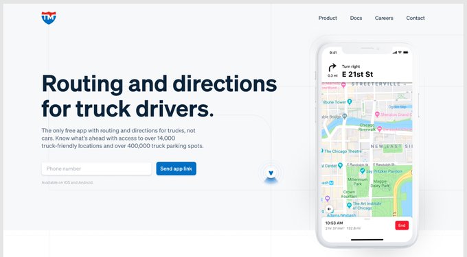
Putting together some pages for the
@TruckMapHQ
inner pages. This is where I find designing the hardest. Trying to differentiate pages from the homepage design enough, so that they feel consistent but not too samey.
5
3
67
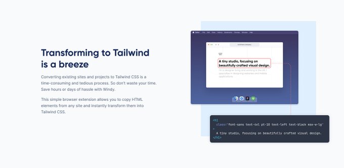
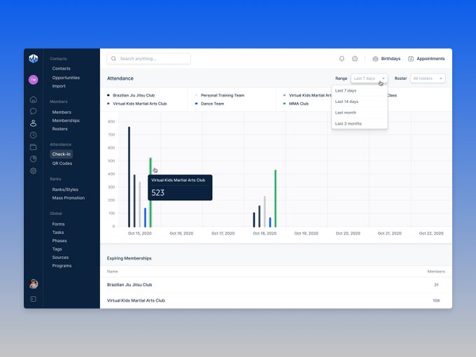
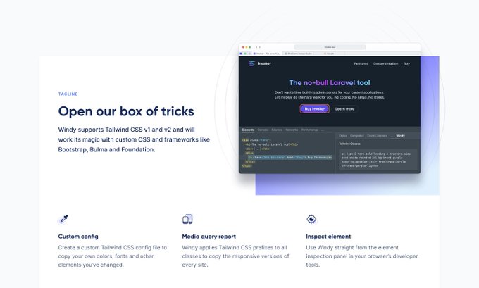
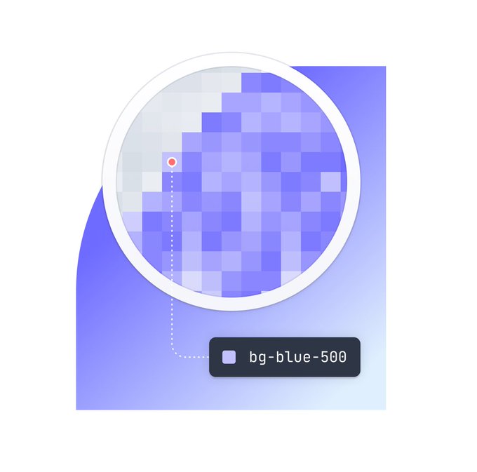
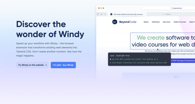
Can’t wait to show you all the brand new
@windyextension
☺️ This is some screenshots from the website redesign.
0
1
51
Today was the final day working with
@sreinstein
on his product Pulse/MarketMuscles. We’ve been working together for a few months now to completely reimagine the UI. I can’t wait until this one goes live!
3
0
46
I also really can’t wait to share what I’ve been up to with
@ormanclark
, getting closer to launching something I’ve wanted to do for years 😅
1
2
45
This week I am helping
@sreinstein
and his team at Market Muscles to design their new product Pulse. Excited for this one! ✨
1
1
39
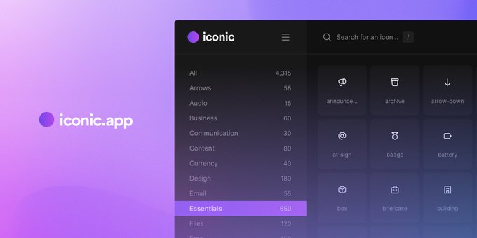
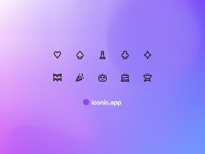
I’ve wanted to design my own icon set for years. When
@ormanclark
reached out and wanted to collab, it was a no brainer that we had to join forces.
Introducing
@theiconicapp
. Sign up and stay updated… or else. 🌚
0
1
33
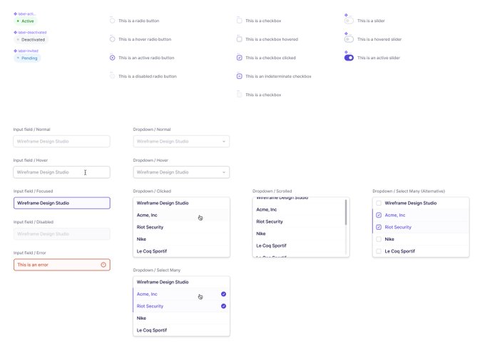
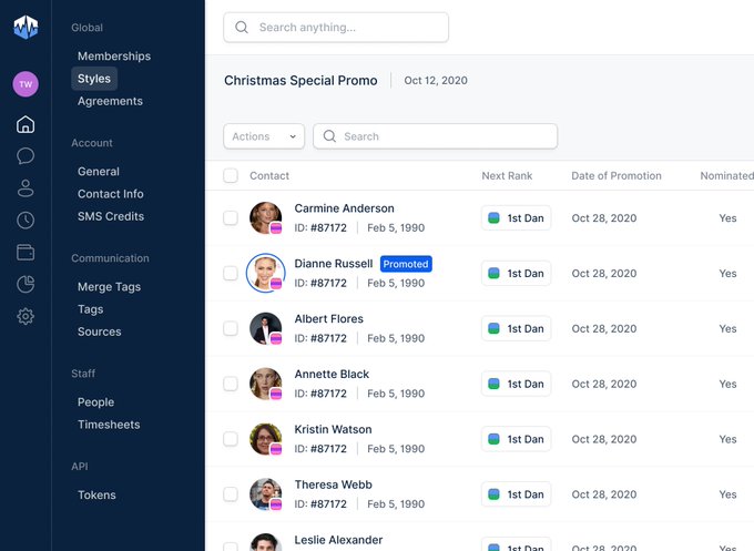
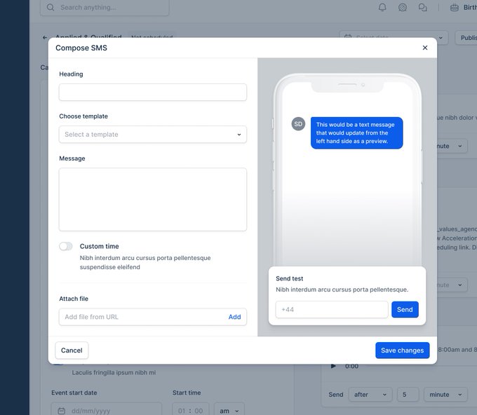
We couldn’t manoeuvre much from the current color scheme of Pulse, but we’re making it work! 🏄🏻♂️
Tip: The little 8px indentation of the navigational URL’s helps to scan this navigation much better. Also, it aligns the focused URL style.
1
1
33
✨🦅
Excited to knock out this super fun little mini-project for
@petericebear
- Hopefully you’ll see more of it very soon.
1
3
31
🌱 Excited to show the new design for that I helped redesign.
Special shout outs to
@howiewrites
for the copy. And
@DianaWebdev
for the pixel perfect dev work.
And lastly to
@marcelpociot
+
@seb_sebsn
for trusting me with the design direction. 🥳
2
0
31

⁘
Available for new projects for Feb/Mar. DM’s are open.
—

0
3
26
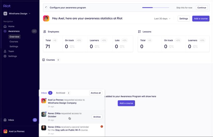
Spending my Saturday morning in bed wrapping up some design work for
@tryriotdotcom
– this project has been a short sprint, but I’ve loved every minute of it.
1
1
25
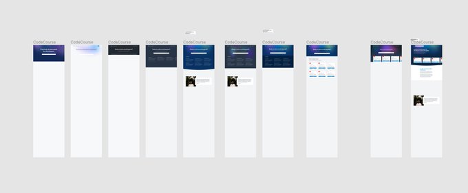
Helping out
@alexjgarrett
this week to redesign the homepage at
@teamcodecourse
! We’re having fun with it.
2
1
23
📢
I’m still looking for the perfect freelance projects to work on in the coming months. Preferably looking to work on landing pages or UI design. Get in touch via DM or email! 🥳
📀

0
2
23
Yesterday I started working with the folks at
@TruckMapHQ
. Excited to share more of this project!
2
1
20
I realised today that I had attached the wrong video. Some more tinkering on this!
0
0
20
It’s been a great month! Had the pleasure of working with
@_livemessage
to design their website, which I completed this week (out soon). ✨
It’s nearly a fresh month with new goals. Happy to announce I’ll be working with the team at
@TruckMapHQ
starting Monday. 🎉
2
2
19
💡 Wondering what I should do with this account. I’m thinking of maybe doing some design tips, or showing my process for designing icons… something along those lines?
4
0
17
🌌
0
0
16
⚡️
@theiconicapp
is live! We are really proud of how it turned out… but we’re just getting started. More to come! Let me know what you think.
👉🏻
0
1
15
✸ ✸
0
0
15
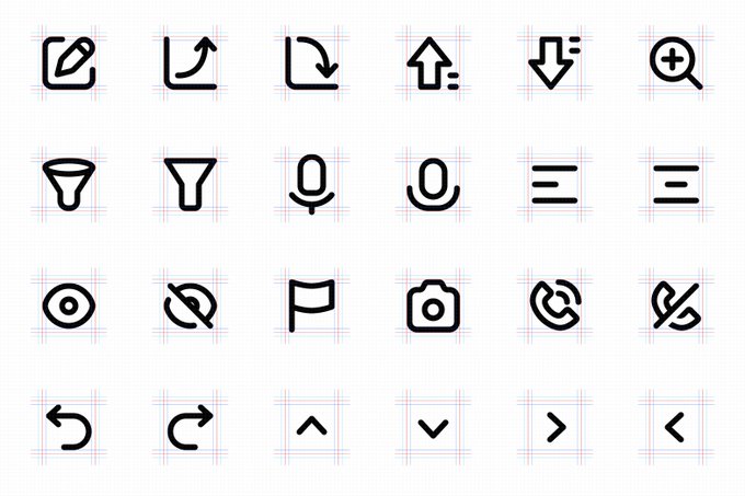
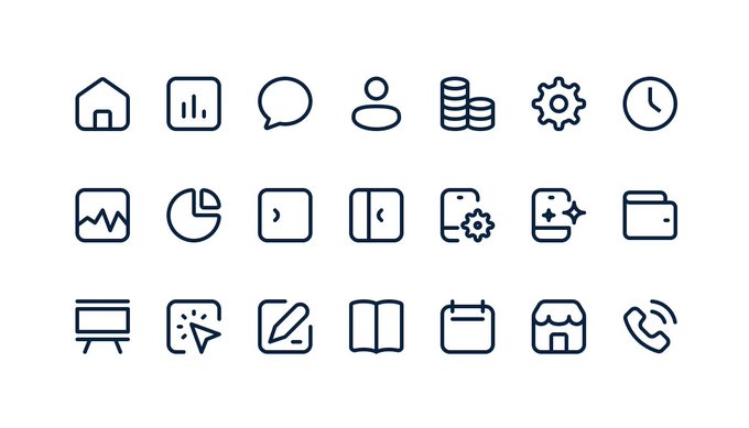
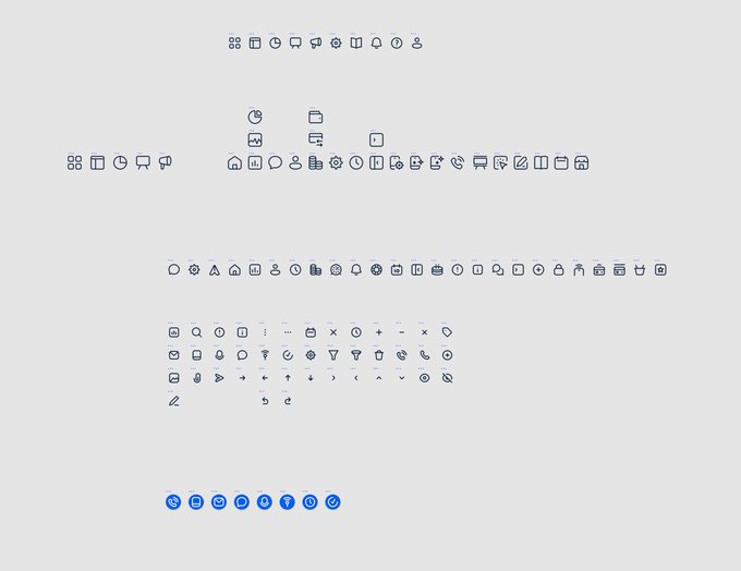
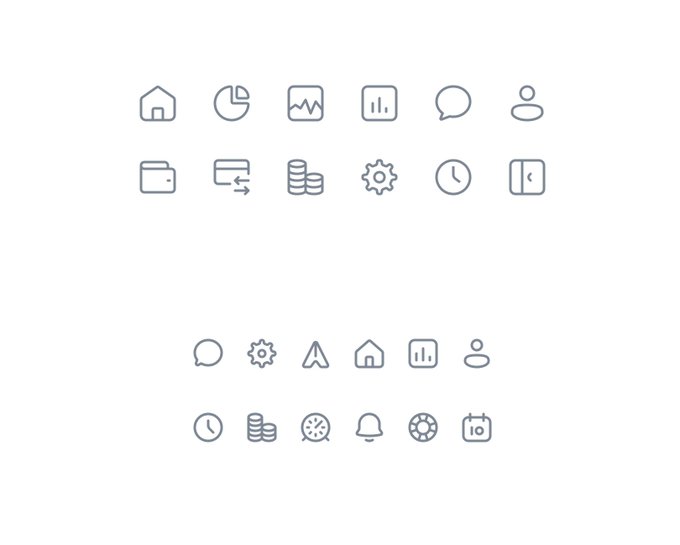
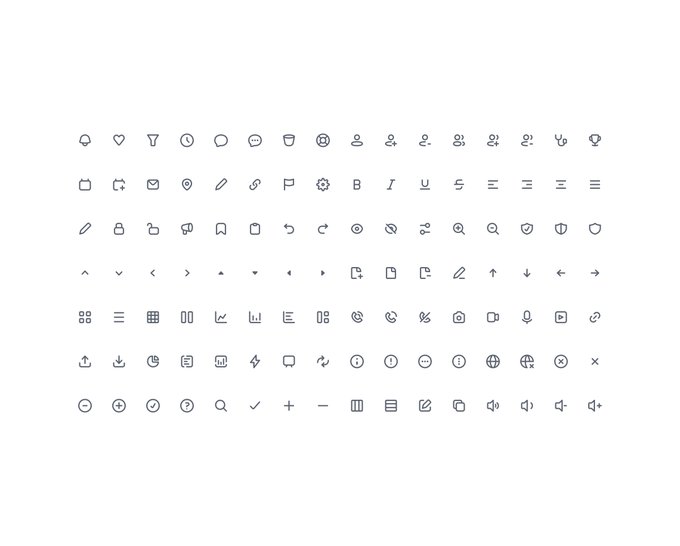
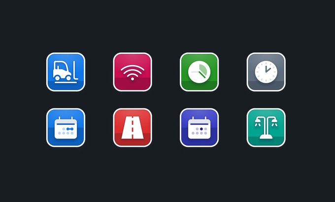
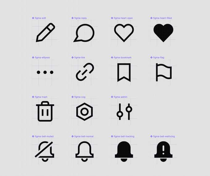
This is just a few from a larger batch of icons that I’ve designed for Table. Really happy with how these turned out.

1
3
13
✨
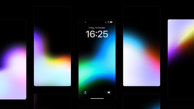
Designed some new iPhone wallpapers. You can grab them on Gumroad.
🥳
0
0
12
Today, I’m happy and excited to be working with Jamie (
@_braindev
) and his team to put together a new website for his new venture.
Happy Monday🎉
2
0
13
I get DM’s about this all the time. I’d love to know what you want to see. Maybe I’ll start planning something 🤗
2
1
12
Two projects that I worked on recently have launched this week!
🅠
💫
2
0
12
Available for new projects ‣
☞ Email or DM. Let's work together!
0
1
10
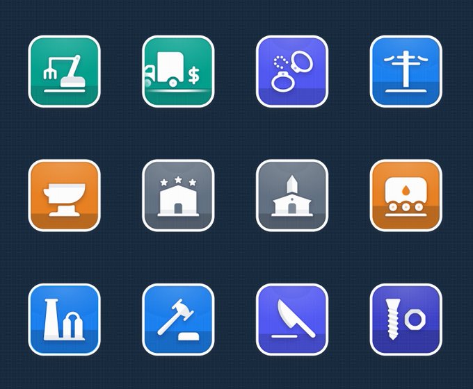
⚡️ Need icons for your project? We release icons every single week. Week 18 just dropped…

0
0
11
1,000 followers on this account 🥳 thanks a lot for following along! Say hello if you haven’t already 🤗
0
0
10
“🚚”
⬗ Load/Unload
⬗ Wifi
⬗ Fast Service
⬗ Working Late
⬗ Reschedule
⬗ Easy Access
⬗ Appointment Required
⬗ Good Lighting
0
0
9
・Space for one new project to start in May.
Reach out if you’re an early stage startup looking to establish their visual design language with a marketing site / landing page. 🤝
・DM or
0
0
9
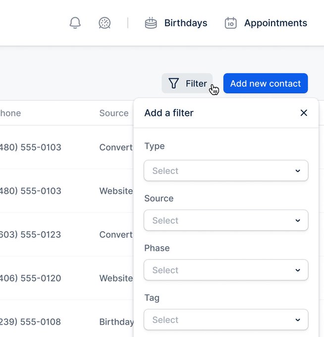
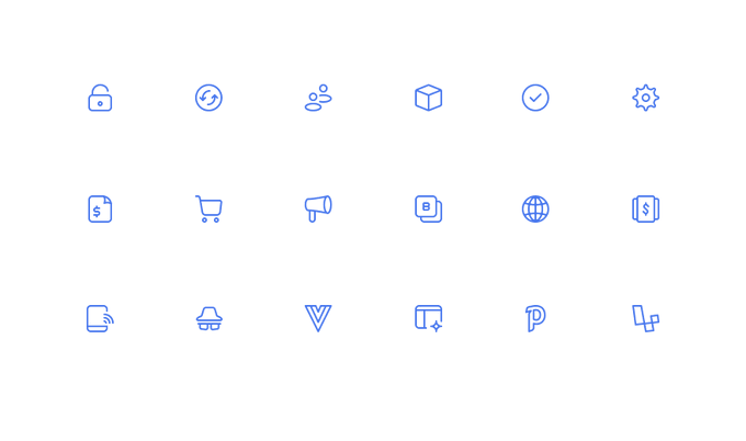
How do you get those faint grid lines inside a Figma component? This would help me ALOT when designing icons.
@rogie
/
@figmadesign

What's everyone working on today?
I'm currently working on these icons for our new support forum we're building at Figma. 😊
17
8
240
1
0
9
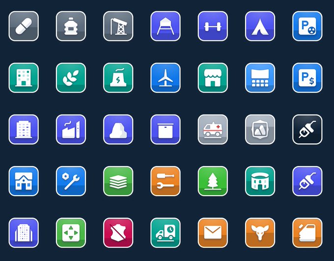
Been really busy recently. I thought I’d enlighten everyone what I’ve been up to.
- For a few months now I’ve been working with the team at
@TruckMapHQ
- can’t wait to get this product into the hands of users!
- Recently I helped the team at
@wearetmsf
build out an iconset…
1
0
8
I have availability for new projects starting in August.
DM’s are open →
1
1
8
🌱 Your favourite sans-serif font at the moment. Go!
10
1
7
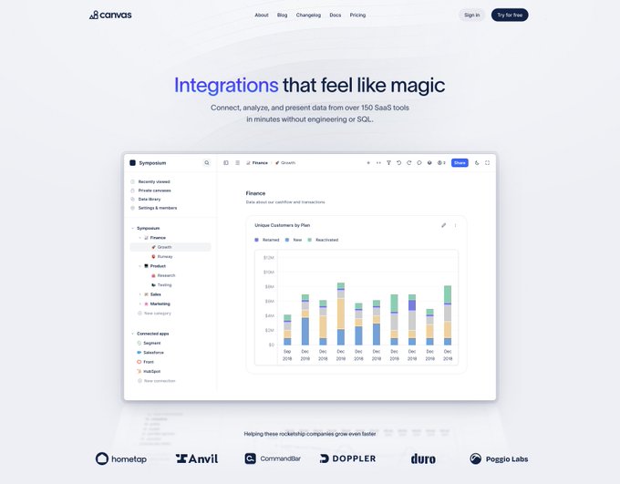
🤝 New client ⁘
@canvas

👋🏻
I’m thoroughly enjoying working with a limited colour palette on this project. With
@Canvas
’ range of features, I want to ensure I create a minimalist design style that employs only selective accents of colour to highlight specific features or elements of the copy.
5
11
272
0
0
7
🌱 Making moves on the CircuitHub UI. Excited with the direction this is going in!
0
1
6
✨ Helped design and launch a few projects recently:
- Laravel Vapor:
- Laravel Forge:
🏀 Also set up a Dribbble account for
@wireframe
, give it a follow!
0
1
6
Hello to everyone who’s recently followed this account! Excited to share some more of what I’m working on.
0
0
6
🥳 A little tease of what I’ve been working on for this collaboration.
1
0
6
…I’m going to show some more of shortly!
Under the circumstances of 2020, it’s been an amazing year for me personally. And just want to thank every single person that decided to work with me.
2021 LETS DO IT! 🎉💙
0
0
6
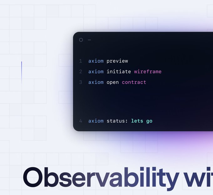
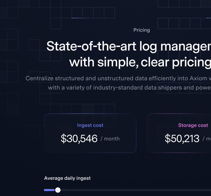
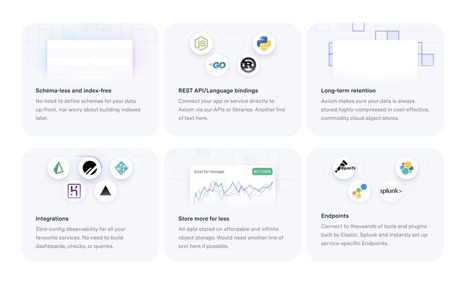
🤩 I’m currently working with the team at
@axiomfm
to redesign their entire website.
Part of the redesign is coming up with a unique set of illustrations and icons.
0
2
5

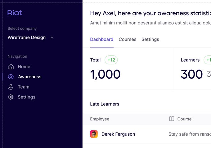
Today, I start work with the fantastic team at
@tryriotdotcom
! 🥳 Excited to show you what we come up with.
1
0
5
🤸🏻♂️
As of Oct 9, I'll be looking for new design projects to sink my teeth into for the coming months. I can help you with anything from web design, UI design for your web/iOS app and icon design.
▲ DM's are open💙
0
0
5
Another client I’m so happy to be working with again is the team behind Tinkerwell, HELO () and many more -
@beyondcode
. I’ll be helping reimagine their umbrella website for all their products 🥳
0
1
5
🔹 Accepting new projects ・
@wireframe
is open for new freelance projects starting in October. Get in touch via the website or send a DM!
0
0
4
...which was such a fun project. Equally excited to show everyone more of that project.
- Also helped
@teamcodecourse
come up with a new landing page. Once this has launched I’ll be sure to tweet.
- Lastly, I’ve continued working with
@sreinstein
on his Pulse product which…
1
0
4
** Should note all the copy here isn’t final. Just copy and pasted from similar websites for now **
0
0
4
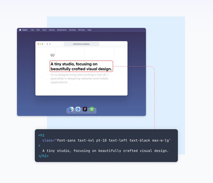
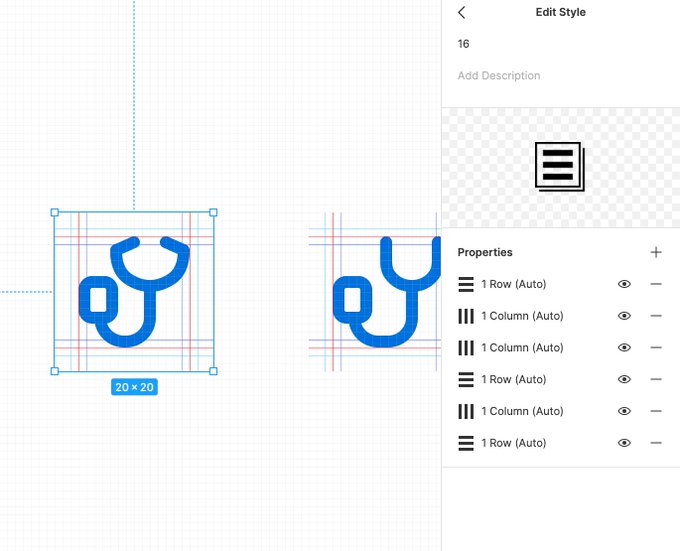
@Imaaronmoody
Just using the grids in Figma.
Light blue = container for the shape (16x16)
Red = 1px padding on these icons
Purple = I use this as a guide where to draw the shapes so the 1px line sits on the red line
0
1
4
You should follow the
@wireframe
Instagram account. Posting some snippets of what I'm working on over there.
✨
0
0
4
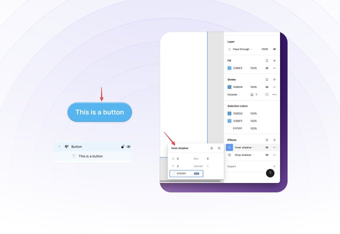
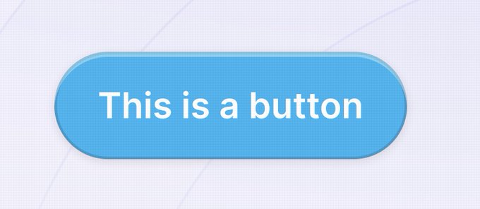
🧵 New thread…
🫣 It may seem like adding a stroke and inner shadow to a button in Figma should be a straightforward process. However, for some reason, Figma has this strange behaviour where the inner shadow overlaps the stroke instead of being added under it.
Unless I’m missing something 🙃
10
5
200
0
0
4